Hallo once more....we meet again, whoever you may be; I hope you learn something interesting as you read this post.
I made some coasters for a friend's birthday present, and after tooling them my husband agreed that they could look really neat if we painted them, since they involved cartoon characters (which never look quite right if they aren't in the same colors they appear in, normally).
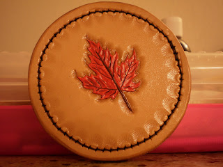 |
| Maple Leaf, the hardest one to paint.... |
Believe it or not, this leaf gave me so much trouble! I loved tooling it, but I thought I would be super cool and make the silly thing green AND red, like a real live Fall leaf.....The result was a scary concoction that reminded me (for some bizarre reason) of what Poison Ivy's leaves might look like if she were growing her plants....it was green in the middle, and red on the edges, but the paint dried so fast that I couldn't do any blending. I'm still working on that T.T In the end, I got tired of it and painted the whole thing a few layers of white, and just made it all red. It was interesting, though, that painting the dark veins over the white layer first made it easier to give the impression of veins after the red layer; I didn't have to paint as much brown vein as I thought I would.
Lesson of the day for newbie painters! If you have to scrap a paint job, try painting layers of white over it until it's actually white and not a pale version of the colors beneath it. It's like getting a clean slate, even if the paint gets a little thick.
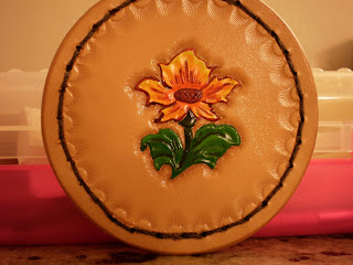 |
| Sun Flower? I thought of it as a real world version of Mario's Fire Flower ^.^ |
This one was cool. The fading worked, woohoo!
 |
| Buttercup! "Wuv, twoo wuv..." |
For all the plants, I tried to use tri-colors to get a shading effect. Now, I've never had a single painting or drawing class in my life....I'm a poor poor child trying to get by on her own, so you awesome art people who grasp this a whole lot better, please look with mercy. The idea of the tri-color thing is that I would have a base color (take the green leaves in this one), like the medium green, then I would mix a slightly lighter and slightly darker green and paint the darker green in the valleys (tooling makes it so much easier to picture this, by the way!), and the lighter green would get brushed lightly on the ridges that would catch light. They needed to be faded a bit into the medium green to make them seem more realistic, but you can do this with any part of the drawing.
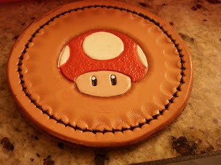 |
| Nintendo's Mushroom from Mario |
These next three are like the Demon Hunter luggage tag: I don't feel comfortable actually selling stuff with copyrighted designs on it. I'm pretty sure I would need written permission from the companies for that, and I have no clue how long that would take or how likely it would be for them to grant it. I could look into it, sometime, though....
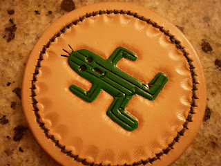 |
| Cactuar from Final Fantasy! Oh the pain! |
Now, you may find it odd that I have these six coasters as one set.....My friend, however, is a fellow nerd, and these three cartoons are from video games that he plays or has played often, and the Cactuar in particular has been a source of much angst for him. I felt he should have three "respectable" coasters, at least, but then these three other coasters are plants, too, though of a more amusing sort.
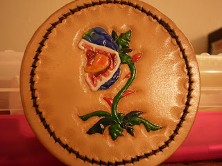 |
| Deku Baba from Zelda: Ocarina of Time |
This guy was just about as hard to paint as the maple leaf! It wasn't quite as sharp as I would have liked, but the fading turned out ok, and I had a lot of fun crouching over this with my glasses off so I could get the details right. You have no idea how much I missed my lovely tiny brush that is several states away, now.....I should just buy a new one.
Thanks again to those who actually find this interesting enough to read! I kind of wish Google would tell me who is reading this, but apparently 17 people saw the first post, and 2 saw the second one O.o I'm kind of astounded.


No comments:
Post a Comment